Some things that have caught my eye lately for a great reason:
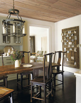 |
| Apartment Therapy |
I love love love the table. The door {at least thats what I think it is!} on the wall is magnificent. And of course the glass door cabinets.
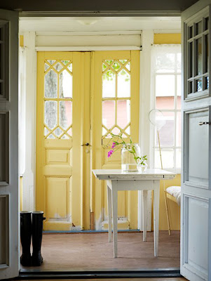 |
| Ish and Chi |
This yellow front door is so stunning to me. Although for my house it would be too much, since our exterior is almost that same exact yellow. For someone else though, yesss please!
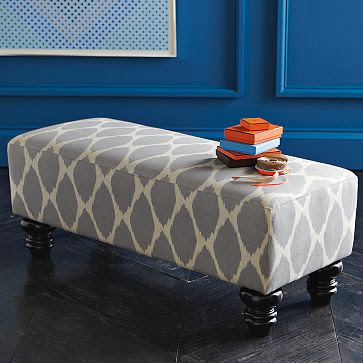 |
| West Elm |
This little bench from West Elm is so fun. I really love the fabric choice, and the legs.
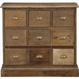 |
| Crate&Barrel |
This Bedford Chest from C&B is amazing. One draw back to me though is that I would much rather find something similar to this at an estate sale or Craigslist, instead of paying the insane price of $699.
Some things that have caught my lately for a badddd reason:
 |
| Apartment Theraphy |
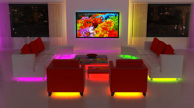
Neon lighting for furniture..nope, not my style. Is this really anyones style?!
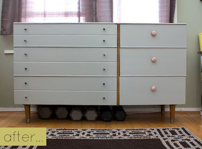
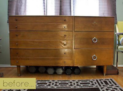
Now this dresser might just be bad to me. I have always lived in AZ and have grown to dis-like the look of Southwestern anything, so to me, this is no good. Especially because this is what it looked like before, and I think I actually would have liked it then:
 |
| Apartment Theraphy |
 |
| Apartment Therapy |

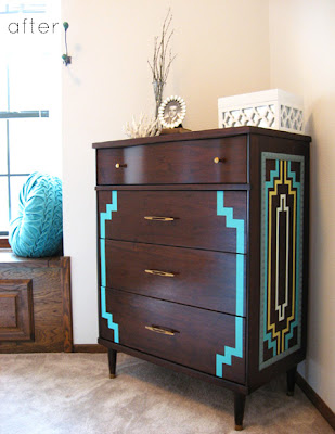

That dresser with the funky painted designs is just odd. It’s like Southwest meets Retro meets Vintage. Just doesn’t really ‘add up’…
I really like the rustic feel to the table in the first picture. It’s totally my style. And you’re right, that yellow door is beautiful, but not if your house is all yellow already!! I love the whimsical feel to the yellow door. It’s unexpected and sweet. Kasey’s right, that dresser is so odd, ha!
I really love this brown chair I saw on Lori Andrews ‘The 10 cent Designer’ page – image 9/10 at this link: http://loriandrewsinteriors.com/portfolio.htm
Not sure where it would fit, but I love the lines.
Kasey- you say it perfectly…glad we agree:)
Michaela- I know, overload on yellow isnt a good idea..bummer!
Cassie- O that chair is so funky and amazing. I wonder how comfortable it would be. It looks super squishy and heavenly.I also simply love the white shell chair, those are always a favorite of mine.
<3,
Adri
i used to hate southwestern themed pieces too until i moved away from az. now I LOOOOOVE them! but yeah all those other pieces that caught your eye for the wrong reason are creepy.
I saw both these DIY Furniture pieces on Apartment Therapy recently, and i completely agree with you on both points! When I first saw the southwestern themed one, I was like, What the….? Both pieces are so much nicer in their original state. If the owners wanted to update the look, staining them darker might have been a better choice. Regarding the sideboard piece, a nice glossy white might have been nice, but not sure i would want to do that if the wood is in such a good condition.
I just recently bought a mid-century modern walnut sideboard from an antique shop, and i’m hoping to stain it a darker colour (as there is sun and surface damage). I didn’t realize when I bought it that it has a veneer (it was in a barn and a pretty good price). Do you have any experience or suggestions? I was planning to sand it down by hand, then do the whole staining bit – i’m just afraid that i’ll make a mistake!
Sorry for leaving such a long rambling comment!