Judging by the response we got on FB and IG, I would say you all loved the reveal of Slump Block Ranch on Friday! It was so fun being able to keep you up to date in real time on the progress of the home. The home itself is {in my opinion} the most stunning one we have done yet! It is definitely the most ‘high-end’ home we have done, but we still feel like we were able to keep it warm and welcoming!
Now as promised, I will be dividing up the house and give details! Lets start with the Master Suite. This room stayed in the same spot, but we definitely added space to the bathroom and closet. When we were doing demo, and even once the room was completed- I knew it felt like a big room. But then, when we added in furniture {Modern Manor staged the home!} the room felt huge! Isn’t it funny how adding something in can make it feel bigger?
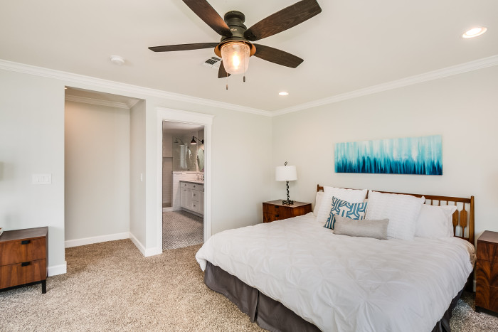
all photos done by ListerPros
There is a great hallway that leads you in to the Master Bedroom, and then the closet is off of the Master Bathroom. I love that the bedroom has french doors that take you to the backyard, and let such great light {and views} in to the room!
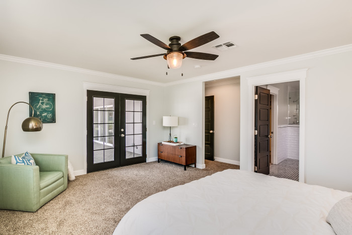
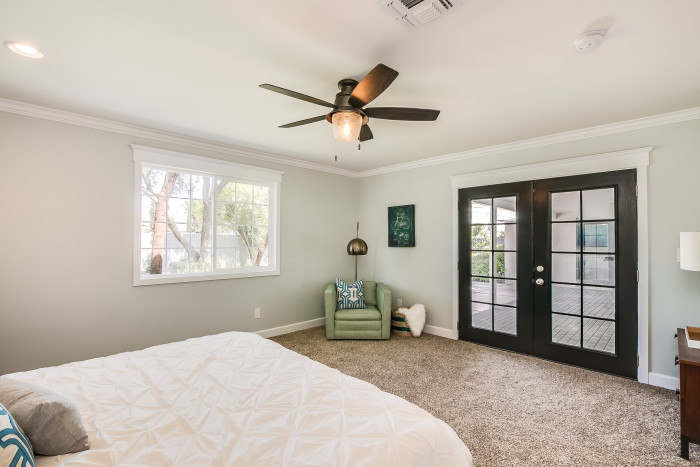
And I love the fact that we went with painting all the doors black. We debated that for a long while, but I am so glad we went with it. Its all about those fun little twists that make a home really fun!
And then theres the bathroom. Ohhh the bathroom. It is jaw-dropping good. This was what they called the Master Bathroom before we got ahold of the house:

While I am sure you could totally make this bathroom function for you, it isn’t this:

I still can’t quite decide what my favorite part of the bathroom is. The walk in double shower probably takes the cake, but I am also just in love with all the tile work. You’ll notice that we moved the sinks onto another wall entirely – fortunately, we were able to find someone like this plumber in Fallbrook who was able to come out and do this for us, as this is certainly not a job that we were not comfortable doing ourselves, given that the we were moving the whole unit. But it makes so much sense where it is now, as people will get the benefit of the natural light coming in through the window when they’re at the sink and looking into the mirrors.
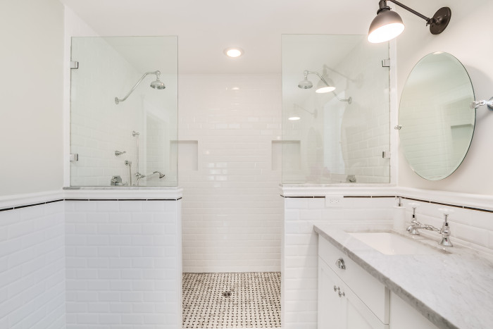
And maybe its because our Master bath at our home has no windows, or maybe its because I bathe in a peach tub every day… but the light and airy feel to this bathroom just makes me giddy.
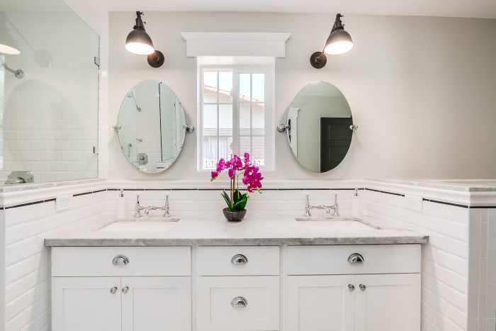
Bringing the subway tile up on the wall like it is a wainscoting is perfect for bathrooms. No moisture issues, no worries of attempted clean up of walls that are coated in hairspray, water, makeup, etc. Just beautiful bright white subway tile:)
And then, right off of the bathroom is the Master closet. This thing is a beast! I totally envision some sort of chaise being set right in the middle. You know- so you can have a place to rest while checking out all of your options for outfits for the day!
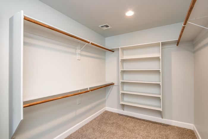
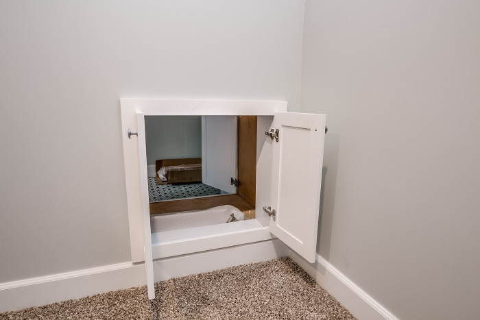
So yes, the size is great…but thats not even the best part! The closet and the Laundry room back up to each other, so Jeremy was a genius and made a little pass through area. CAN YOU EVEN IMAGINE?! I would be forever happy if all I had to do was simply slip a basket of clothes through a little hole in the wall, and my laundry is in the correct room! Yes, this is totally not a NEED in a home, but heck- now that I know about it, I think it is a need;)
And thats the Master Suite my beautiful friends. How many of you would love to just move on in? I know I want to!!
If you or someone you know is interested in this home, or any of our other Flips- contact Jeremy at Gluch Group
Sources:
All furniture- Modern Manor
Black bathroom lights- Schoolhouse Electric Princeton Junior Sconce
Oval tilt mirrors- Amazon
Faucets- Signature Hardware Monroe Bridge Faucet
Shower system- Signature Hardware Vintage
Countertops are Marble
Flooring- Bianco Carrara Basketweave on Amazon
Cabinet Pulls- Amazon
Cabinet Knobs- Amazon
Disclosure: post contains affiliate links
