The most important part of a home to us is the kitchen! Hands down! Whenever I plan a kitchen renovation Montreal, I ALWAYS make sure I go over every inch of the plans to ensure the end result is perfect. While a beautiful Master suite, and great living room are fantastic to have, the kitchen is the heart of the home. And yes, I believe that is true even for those who don’t like to cook. Because let’s be honest, take-out containers still go in the kitchen first, right?!
So here is what we were starting with for the kitchen in Double Dormer:


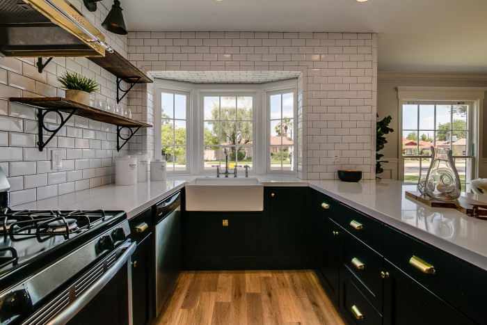
And this is what we ended up with:

There were some pretty big changes that took place. For starters we really opened up the room in two ways. One, we removed the soffits and that added SO much height to the kitchen. We also removed almost all the upper cabinets. Now sometimes that can make me nervous because then where do I put all my junk! I mean, I like to cook, so I have a lot of kitchen gadgets. BUT this kitchen has plenty of lower cabinet space, and an amazing Pantry right by it- so the open shelving is a great fit for this home!


Some other big things we did was add the subway tile backsplash everywhere. It makes such a bold statement having the backsplash not only go so high, and be so visible, but also to have it fully wrap around the bay window {one of my favorite things!!} is amazing. It looks brilliantly put together, and the bay window certainly draws the eye, hopefully, it will stand the test of time but if we have any issues with it then we may look into something like a bay window replacement service to see how they can spruce it up if needed.

For the counters we went with a white Silestone and it’s rad because it is literally pure white. Most counters we have used in the past have some movement to them, but this one is just clean and white! Such a great contrast to the pitch-black cabinets! If you are thinking about changing your counters to something similar to this but with your own design twist, you may want to click here to visit Francostone for free to view their range or check out your local remodeling store to see how they may be able to help you.

Lets just talk for a minute about my all time favorite part of this kitchen. Hands down- the brass hood. I mean, does it get better than that? Truly?! I don’t think so. This thing is such a statement in the kitchen and is what your eye is drawn to immediately when you glance over at the kitchen from the front door. I am determined to take good care of it, too. I know when you cook frequently cooker hoods become dirty, which is why companies like Hoodz of Providence and many more are available to keep hoods like mine as clean as they can be.


We loved using the classic apron sink in here as well. The design of that, on top of the awesome function of having a big open sink just can’t be beat! Ready for some sources?
Countertops: White Silestone
Cabinets Color- Sherwin Williams Black
Cabinet hardware- Home Depot
Open shelves- Porter Barnwood
Apron sink- Lowes
Hood- Craigslist
Black Lights- Amazon
Faucet- Home Depot {but this one is now discontinued}

I would LOVE to hear what your guys favorite part is? The hood? The window? The contrasting counter to cabinets? Let me hear it!
TGIF my loves!

What an amazing transformation! It is just stunning. If the new homeowner isn’t a cook, he/she can just say that the kitchen is too beautiful to cook in.
Have a question. In your list of sources, you listed the cabinet paint color. Did you install all new cabinets and then repaint them? Or did you keep the old boxes and just reface? I’m about to get bids on refacing our cabinets and considering black lowers and white uppers.
Im so SO sorry i didnt see this comment till now. These cabinets are all new.
The kitchen (and the whole house!) look great. The hood came from Craigslist? I will have to keep a closer eye on that site! Cheers – CT
I know- crazy right?!
This is awesome. Can I ask where you got the cutting board from? The grain is beautiful (along with everything else you did).
hi joanna! all things are from Modern Manor, or something they own for staging:)
SO unbelievably pretty, Adrianne! Awesome job!!
Gorgeous! I love the contrast between the black and white. I would have gone with a brass faucet, though, in keeping with all the other brass fixtures. Great transformation.
Thanks Laurie!!!
I love it all!! Especially the subway tile being used all around!! Can I ask what kind of floors those are? We just broke ground on our home and I am so thankful to have run across your blog for inspiration!!
thanks carrie! the floors are a light oak!
really nice work! I also have the same question that your first commentor Lin had about the cabinets. I was redirected to your blog from another blog I read so I am a newbie and not sure where to find the cabinet info out. Thank you so much in advance <3
Toni
Hi Toni! Thanks! THe cabinets are all new, and painted black. Does that answer your question? Let me know if not!