When looking for homes now, everyone wants an open concept home. And rightfully so! Being able to be in one room, and see and interact with the people in all the other main rooms is just awesome. No one wants to feel confined and blocked off. I think the open concept is especially important for families. While you are getting dinner ready for your family, you can have the kids finishing up homework in the family room, and getting the table set at the same time.
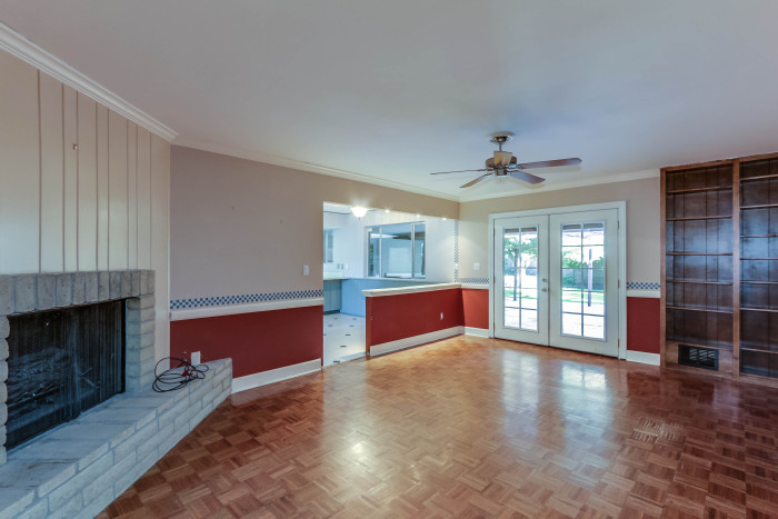
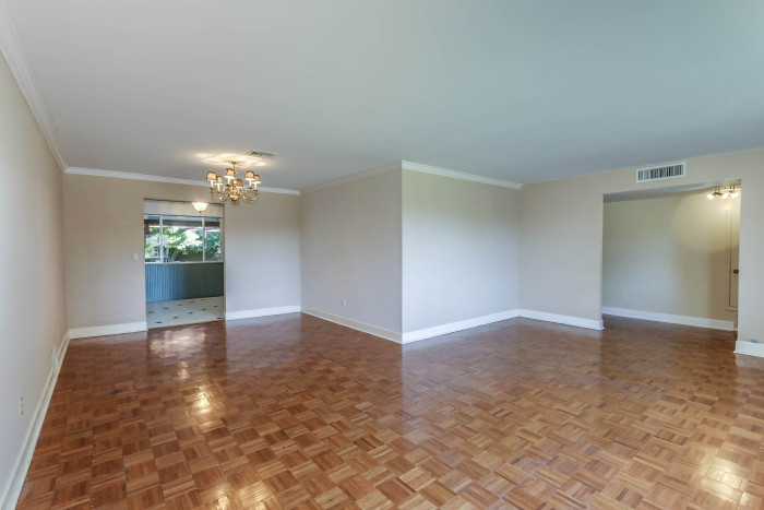
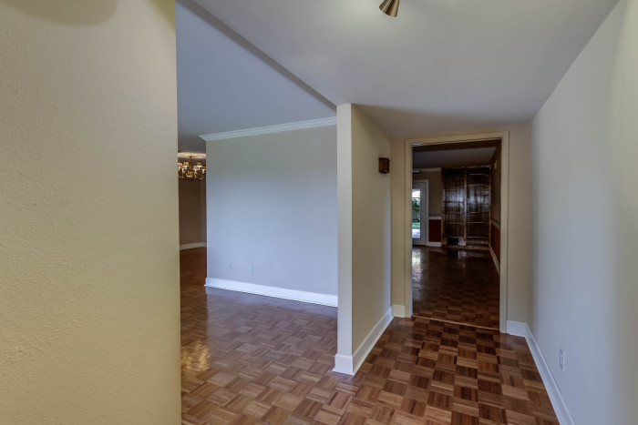
This home was not an open concept at all. There was an awesome fireplace in it, but it was in the very middle of the room, with walls surrounding it. The whole space was broken up into awkward chunks.
When we went in, the first thing we did was open it up and rearrange rooms. We moved the kitchen to the front of the house, and opened up the living space more! Now this is what you see:


The dining room, living room, and kitchen are all open to each other. And one of my favorite features of the home is the barn door. Not only is this door amazing and super old {we refinished it, and actually added on a few inches to it to make it work}, but it also closes off the hallway to the other bedrooms. Perfect for if you are having friends over, but don’t want the noise to keep your kids awake!
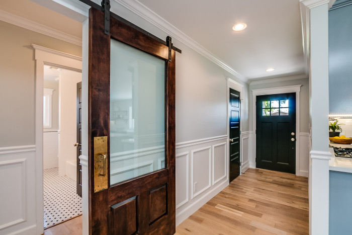
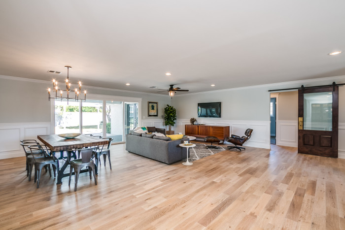
I love the feeling this space gives off. It is inviting and light, open and airy, and makes me want to take up residence there:) The wainscoting and crown and baseboard are obviously favorites of ours since we have the same thing in our own home! And the double french doors that open up to the covered patio of the backyard are awesome about bringing the outside, in! They are easier and cheaper to have installed than you might think as well, especially if you get a Renewal by Andersen sliding doors, for example.
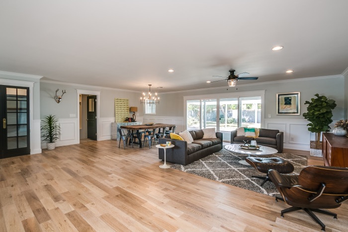
So what do you think? Could you see yourself living here? Is there anything you would have done differently?
Sources:
Hardwood Flooring- Oak {from our flooring guys professional source}
Chandelier over dining table- West Elm Arc Mid-Century light
Ceiling Fan- now discontinued, but from Lowes
The rest of the items you see are apart of Modern Manors staging job!

Well since you asked….. I would’ve left more in the budget for curb appeal from the front. It is lacking. The fence looks like plastic straws. With all the talent you all have , I think you dropped the ball . Don’t let this comment ruin your weekend, it’s meant to be constructive , the house is a ten , inside. As they all have been. Keep up the great work!!!
Thanks for the feedback Karen. The fence doesn’t look {nor is it} flimsy in person, so maybe photos just dont do it justice:) I will show more exterior photos in a post coming up, so hopefully you like it! Thanks for being supportive:)
I can’t believe this transformation! You guys have done an amazing job on this property.
Thanks Leah!
Hi Adri,
I’ve been reading ever since your last home was celebrated throughout the blogosphere. How exciting to see you start your flipping business! It’s obviously what you’re both meant to to do! I love seeing the work you’re doing on your Friday flip posts and this is an incredible transformation. The one thought I had was actually more about the staging that the renovation itself. The way it’s set up it seems like there’s almost TOO much space between the kitchen and living room (at least that’s how it looks in the pictures.) It looks like a huge boulevard between the spaces thats not really used. I’m curious if that was ever a comment or a concern? It may just be the photo… Thanks! Erin
Hi Erin,
sorry for the delay in this. I think it may be the photos, because in real life it didnt seem like too much of a gap. Thanks so much for the input though, and the encouragement. It means a lot:)
Please tell me where this dining room table is from or where to get the iron base-I love it!! I have been wanting to make one.
thank you!
Hi there! All furniture in this home is from Modern Manor, a local store here in Phoenix:)